School campuses bring together children, families, teachers, contractors, and delivery drivers in a space that changes from hour to hour. Clear, consistent safety signage helps everyone read the environment quickly, choose safe routes, and follow campus rules. If your school signs have not been reviewed in a while, now is the time to update them so they match current expectations and remain easy to understand for students of all ages.
Why Schools Should Review Safety Signs This Year
Safety practice evolves as risks change. The last few years introduced new health protocols, temporary layouts, and altered traffic flows around pick-up and drop-off zones. Even if the regulations at your school have not shifted much, the people using your campus might be new. Fresh cohorts of students and families arrive each year, which means signs must work for first-time visitors as well as long-time staff. A short review helps keep the system tidy, readable, and aligned with what actually happens on site.
Faded Signs
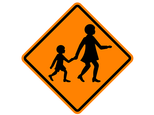
Outdoor signs take a beating from UV, wind, rain, and cleaning. If colour contrast has dropped or text is hard to read even at short distances, the sign is not doing its job. Faded parking controls, pedestrian warnings, or playground rules can lead to hesitation and inconsistent behaviour. Replace these items with correct colours, symbols, and type sizes so students, carers, and staff can read messages at a glance when they approach on foot or in vehicles.
Quick checks for fade issues
- Colours look washed out or different across identical signs
- White backgrounds have yellowed or darkened
- Text is legible only up close rather than at the intended viewing distance
- Photos from your phone show poor contrast when brightness is reduced
New Dangers
Campus risks are not static. Health alerts, construction works, temporary classroom relocations, and changed traffic plans all introduce new hazards. When conditions shift, add or relocate signs that set expectations at the point of decision.
For example, a new one-way loop for vehicles during building works should come with early direction cues and repeated reminders near intersections. If you have added hygiene stations or changed room capacities, make sure entry signs, flow arrows, and waiting areas are clearly marked and easy to follow.
Where new dangers often appear
- Temporary walkways near building works
- Changed car park layouts during events or exams
- New hygiene and health protocols at building entries
- Short-term closures of play spaces or ovals after weather events
New Standards And Regulations
Standards and local requirements are updated periodically to improve clarity and consistency. Even if the core categories remain familiar, design details such as symbol sets, colour values, and wording can change. Review your inventory against current expectations and replace non-compliant items.
This is particularly important for traffic-related controls around school zones, crossings, and car parks where visitors rely on consistent messages.
What to align
- Colours and shapes that match recognised categories
- Pictograms that reflect the current symbol set used in schools
- Wording that is concise, unambiguous, and easy for children to understand
- Mounting heights and placements that suit both adults and younger students
Damaged Signs
Vandalism, accidental impacts, and routine wear can make a message hard to read. Bent posts, cracked substrates, peeling laminates, and scratched faces reduce visibility and can create sharp edges. Replace damaged signs promptly, especially where children gather or where vehicles move close to pedestrians.
If a location is repeatedly affected, consider more robust materials, anti-graffiti finishes, or altered placement that keeps signs in view but out of harm’s way.
Signs that should be replaced immediately
- Cracked acrylic or polycarbonate that can splinter
- Sharp or curled aluminium edges
- Posts that lean or wobble when touched
- Faces that have been painted or stickered over critical text
Keeping Things Fresh
People stop noticing messages they see every day. This sign fatigue is common on school sites where the same route is used multiple times daily. Small changes in layout, scale, or placement can restore attention.
Rotating a message to another post in the same area, improving contrast, or upgrading to reflective material for early morning and evening light can make a big difference. The goal is not to add more signs but to make the essential ones stand out at the moment of decision.
Ways to fight sign fatigue
- Simplify clusters so only the critical messages remain
- Use larger text for the main instruction and reduce secondary wording
- Remove duplicates that compete for attention
- Improve lighting or switch to reflective faces where visibility drops
Upgrading Temporary Signs
Temporary signs have a place during short-term changes, but they should not become permanent by accident. If portable frames, handwritten notices, or taped arrows have been in place for months, convert them to durable equivalents with correct colours and symbols.
Temporary items are often small, inconsistently positioned, and easy to miss. Permanent versions reduce confusion, especially for visitors and new students who are not used to ad-hoc messaging.
When to upgrade
- A temporary route or rule has lasted beyond a term
- The message affects vehicle movements or pedestrian safety
- Portable frames are blocking footpaths or sightlines
- Handwritten notices are fading or falling off
Bonus Branding Avenue
Safety signs can also support school identity without weakening the message. Using a consistent font for headings, adding a small logo in a reserved area, or matching colour accents to school identity can help visitors recognise official messages. Keep brand elements subtle so the safety meaning stays dominant. When done well, branded signs look intentional, reassure families, and discourage tampering.
Branding without clutter
- Reserve a small corner or header strip for school identity
- Keep the main field clear for the safety message
- Use the same brand treatment across the site for a tidy look
Placement And Visibility
Even the best sign will fail if it is hidden behind a door, a bush, or a parked vehicle. Walk each route as a child and as an adult, then fine-tune locations so every message is visible at the right time. In car parks, size the legend for drivers reading from a moving vehicle, not a person standing next to the post. On footpaths, place signs at eye level and repeat on long approaches so the next cue is visible from the current one.
Placement checklist
- Clear line of sight from typical approach angles
- Mounted at consistent heights for readability by adults and older students
- Repeated over long distances and after turns
- Not blocked by bins, fences, temporary equipment, or vegetation
Materials And Durability
Choose materials that suit the environment. Coastal air, high UV, frequent cleaning, and ball impact in play areas all affect longevity. Aluminium with quality reflective sheeting, UV-stable inks, and anti-graffiti laminates can extend service life. Indoors, consider rigid substrates with rounded edges and non-glare finishes. A small uplift in specification at purchase often saves money over time.
Specifications to consider
- Reflective grades for car park and roadway visibility
- Anti-graffiti film for high-touch locations
- Rounded corners and safe edge profiles near play spaces
- Corrosion-resistant posts and fixings
Training And Communication
Signs work best when they match the language used in assemblies, newsletters, and visitor instructions. Include key messages in family communications, induction packs for contractors, and relief teacher notes. Use the same pictograms and wording on posters, maps, and classroom reminders so students recognise instructions wherever they see them.
Ways to reinforce messages
- Add campus maps with key sign locations for events and parent nights
- Use photos in newsletters to show updated routes or waiting areas
- Brief crossing attendants, cleaners, and grounds staff on changes
- Invite student leaders to help spot confusing locations
Auditing Your Campus
A simple audit keeps the system current. Walk one route each month and record issues before they pile up. Replace, relocate, or remove items based on what you find. Keep a list that includes location, message, installation date, and any maintenance notes. This avoids drift toward clutter and helps budget planning.
Quick audit steps
- Photograph each sign from the approach angle
- Check legibility from the intended viewing distance
- Note obstructions and fix them or move the sign
- Remove duplicates and outdated messages
- Schedule replacements for faded or damaged items
Final Reminders
Safety signs are a shared language for your school community. Keep them clear, consistent, and placed where decisions are made. Review them regularly, involve the people who use the space, and replace items before they fail. If you need tailored designs that fit your context, talk to your signage supplier about options for durable materials, correct colours, and easy-to-read layouts.